
Brand
Identity
Communication
Copywriting
Web
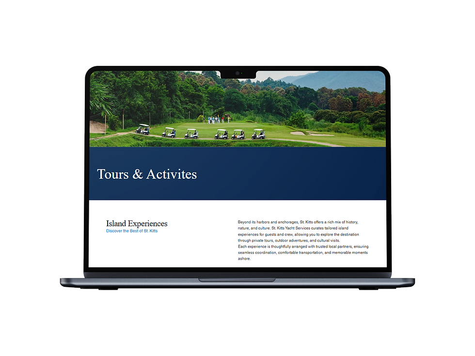
St. Kitts Yacht Services
From customs and immigration clearance to provisioning, concierge, and port logistics, St. Kitts Yacht Services manages every aspect of your arrival and stay in the Caribbean.
Through a complete Website overhaul, we clarified their offering, elevated their positioning, and created a digital experience that makes their services easier to understand, trust, and act on.
.png)

The logo combines a compass and ocean waves to reflect both direction and environment. The compass represents precision, guidance, and reliability core to managing yacht arrivals and logistics while the flowing wave element adds a sense of ease and continuity. Together, they create a balanced mark that communicates a service which is both structured and seamless, turning complex operations into a smooth, well-managed experience.
Century Gothic
Century Gothic was chosen for its clean, geometric structure, which enhances clarity and readability across the site. Its modern, minimal form complements the brand’s refined and structured visual identity.
Times New Roman
Times New Roman was chosen to bring a sense of timeless sophistication and authority to the brand. Its classic serif form adds contrast against the clean modern layout, giving the website a more refined, editorial feel while reinforcing the premium and elevated nature of the service.
#03274D
#03274D
#000000
#FFFFFF


The website works by turning a complex set of services into a clear, structured, and easy-to-navigate experience. The hero focuses on outcome over features, helping users instantly understand the value, while the service sections break everything into clean, scannable blocks for quick access.
Content is short, direct, and benefit-led, reducing friction and keeping users moving. A strong visual hierarchy guides attention naturally, and consistent CTAs make next steps obvious.
Overall, the design prioritizes clarity, speed, and trust- making a complex service feel simple and well-managed.
